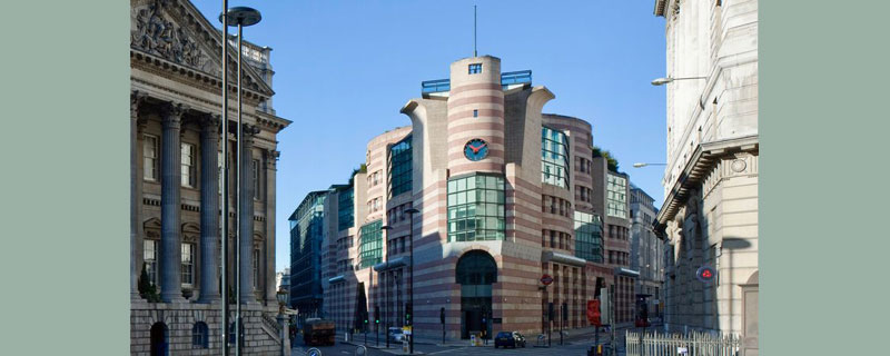
If you’ve seen it, you’ll know the exact building this is, even if you didn’t know its official name. The building once named among London’s “ugliest, most hated” has a tendency to leave an impression on passers-by – but not necessarily a good one. Sitting directly opposite Bank tube station to greet unwitting passengers as they alight from the trains, No 1 Poultry sticks out like a sore thumb.
The building, which began construction in 1994, is a far cry from the classical architecture surrounding it. Unless you’re inside it, using one of the offices, co-working spaces, or the rooftop garden restaurant, there’s no escaping this wedge-shaped carbuncle, which dominates the fork where Queen Victoria Street meets Cheapside.
As well as its unusual form, an intriguing decision by architect James Stirling to clad the five-storey building in pink-and-yellow limestone make it unmissable; particularly from its vantage point between two of London’s busiest streets, where it splits the bustling traffic thoroughfare like a giant piece of streaky bacon.
In fact, Londoners steadily became so “angry” about the ugly building that by 2016 the council was overwhelmed with demands to have it pulled down, according to Architecture Tour Guide. But the vocal vexation had the reverse of its intended effect, and totally backfired when the government doubled down and made it a Grade II listed building – the youngest in England.
No 1 Poultry may be a protected historic building now, but that hasn’t stopped it from being the subject of endless scorn from Londoners, who are frequently so incensed by its ugliness that they take to TripAdvisor or Google reviews to vent about it. Reviews of the building’s exterior range from the appalled to the downright baffled.
“I get a shiver down my spine every time I walk past this horror show,” wrote one scandalised Londoner on Google reviews, who continued: “A building that looked dated before it was even finished. When I think of what was demolished to make way for this stripy dollop of towering awfulness, I have to reach for the hankies. Only in Britain.”
One Londoner described No 1 Poultry as a ‘stripy dollop of towering awfulness’ (Image: View Pictures/Universal Images Group via Getty Images)
“Strutting cock or plastic chicken?” asked another recent visitor to the building on TripAdvisor, who seemed unable to make up their mind about No 1 Poultry. “I am a little conflicted about the whole design,” someone seconded, adding: “It’s colourful and anywhere else, I would like it. As it stands in Bank amongst some grand old buildings, it just seems oddly out of place.”
One visitor suggested No 1 Poultry had perhaps been “inspired by lego,” which might explain the numerous complaints about how “dark” the building is, particularly in the atrium. “I have never liked it,” whinged one visitor, who explained: “it looks very dated by modern standards and it is quite dark inside.” Another person simply wrote: “Very ugly.”
Interestingly, although Londoners despise the look of No 1 Poultry, most visitors to the services inside tell a totally different story. Glowing reports left by people using the co-working spaces have praised the “awesome venue” which reportedly boasts a huge amount of space for workers, with “great amenities,” and – somewhat surprisingly – “tasteful decor” on the inside, if not the outside.
MMC comment

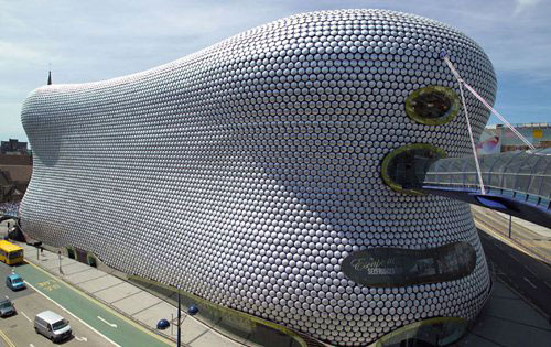
We wondered what our readers think of No. 1 Poultry, for my part I think The Selfridge Building in Birmingham takes the crown for the most ugly, love it or hate it, once seen it is regrettably never forgoten.


Leave a Reply
Want to join the discussion?Feel free to contribute!